Overview
Viewports define the screen dimensions and browser configurations the Spur Agent uses when running tests. By testing with the same viewport settings your customers use, you ensure accurate visual regression detection and functional validation across devices.Key Benefit: With Spur, you can run the same test across multiple viewports simultaneously if your test uses intent-based instructions rather than pixel-specific coordinates.
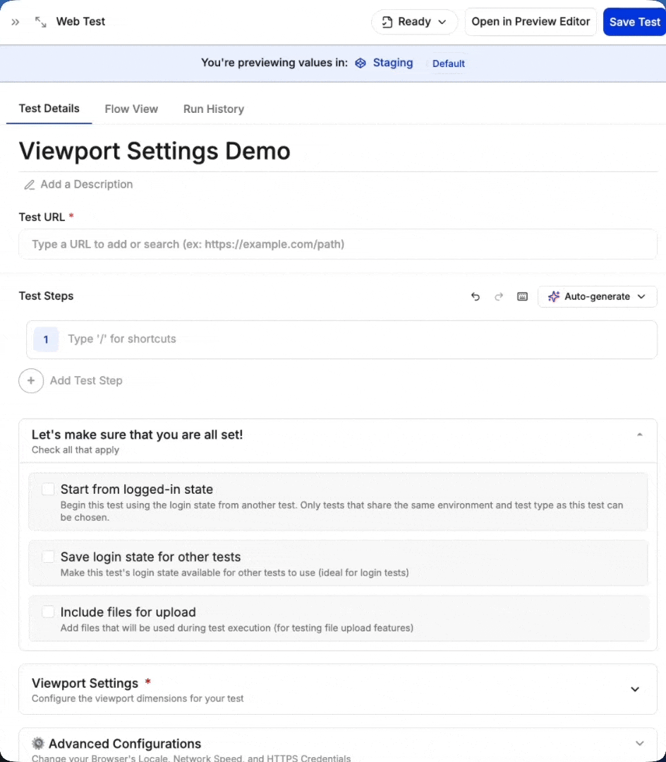
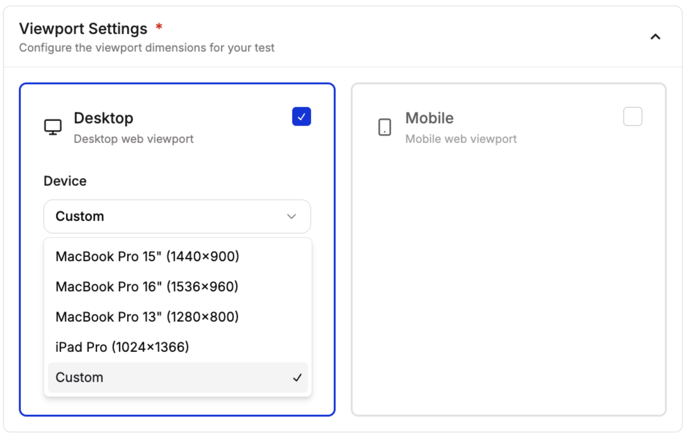
Configure Viewport Settings
When creating a test, scroll to Viewport Settings and choose Desktop, Mobile, or both.
Choose from Desktop and Mobile Web Viewports
Test can be configured to run on both desktop and mobile viewports as well.
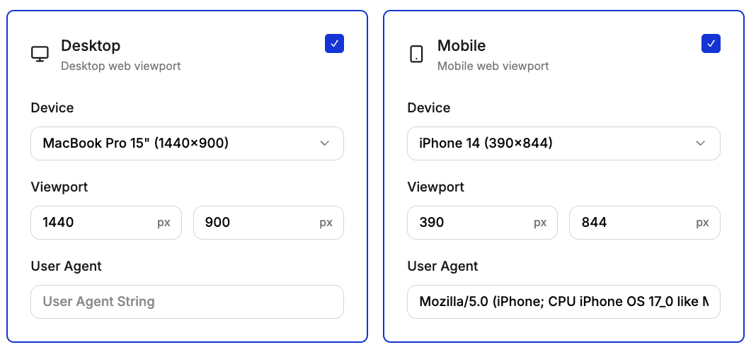
Choose Dimensions
Presets for Desktop Testing:
- MacBook Pro 15” (1440×900)
- MacBook Pro 16” (1536×960)
- MacBook Pro 13” (1280×800)
- iPad Pro (1024×1366)
- Custom
Presets for Mobile testing:
- iPhone 14 Pro Max (430×932)
- iPhone 14 (390×844)
- Samsung Galaxy S24 UI
- Samsung Galaxy S23 UI
- Google Pixel 8 Pro (412×915)
- Google Pixel 7 Pro (412×915)
- Custom
You can create custom viewport dimensions as well.
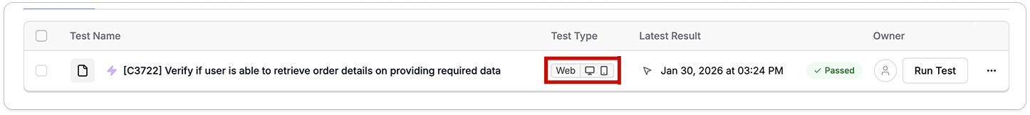
Testing Multiple Viewports
When you select both Desktop and Mobile viewports, Spur runs your test twice: once for each configuration. This is particularly valuable for responsive design testing.When testing multiple viewports, your test will consume 2 test runs. Each viewport configuration counts as a separate execution.